Why this matters now
Teams are working harder than ever, but harder doesn’t always mean better. Employee performance analytics isn’t about watching people — it’s about understanding what work actually creates value, where friction is burning time, and when workload is tipping someone toward burnout. When done right, it helps teams get more done with less stress and gives leaders clear evidence that improvements are paying off.
What this piece will give you
Over the next few sections you’ll find a practical, no-fluff approach: what to measure (and what to avoid), a six‑metric core you can stand up this quarter, a 30‑day build plan for your analytics stack, and quick‑start templates for education, healthcare, and insurance. You’ll also get simple ROI models so you can translate hours saved and error reductions into dollars — and a short governance checklist to keep this work ethical and trusted.
Who this is for
If you’re a manager who wants clearer signals instead of intuition, a people-ops lead trying to reduce turnover, or a data leader delivering tools managers will actually use, this guide is for you. Expect practical examples, checklists, and concrete metrics — not vague theory or surveillance playbooks.
Quick preview
- Focus on outcomes, behaviors, and capacity — not monitoring.
- Six metrics you can measure this quarter to improve quality, throughput, efficiency, goals, capacity, and automation leverage.
- A 30‑day plan to map sources, baseline performance, build useful dashboards, and set governance.
- How to convert reduced after‑hours work and error rates into a simple ROI and burnout‑to‑turnover model.
Want me to add up‑to‑date, sourced statistics (for example, industry burnout rates or studies showing hours saved by AI assistants)? I can fetch reliable sources and include links — just tell me which industries you’d like data for and I’ll pull the numbers and citations into the intro.
What employee performance analytics measures—and what it shouldn’t
Focus on outcomes, behaviors, and capacity—not surveillance
Design analytics to answer: did work deliver value, and how can we help people do more of the high‑impact work? Prioritize outcome measures (customer impact, defect rates, goal attainment), observable behaviors that predict outcomes (collaboration patterns, handoffs, time spent on value‑add work), and capacity signals (workload, after‑hours work, time off). Avoid treating analytics as a surveillance tool that counts keystrokes or polices hours—those signals destroy trust and obscure the real levers for improvement. When used ethically, analytics should enable coaching, remove blockers, and inform process or tooling changes that raise overall performance and wellbeing.
Enduring categories: quality, throughput, efficiency, goal progress
Keep your measurement taxonomy simple and stable so leaders can act on it. Four enduring categories capture most of what matters: Quality — measure accuracy, rework, and first‑time‑right outcomes across key workflows. Throughput — track completed value units (cases, tickets, patients seen, policies underwritten) per time per FTE to see capacity delivered. Efficiency — measure cycle efficiency (value‑add time versus total elapsed time) and identify handoff delays or waste. Goal progress — map initiative and OKR progress against plan so teams can course correct early. Use these categories to align teams, tie performance to concrete outcomes, and avoid chasing vanity metrics that don’t drive value.
Add the missing pieces: burnout capacity and risk/compliance signals
Standard operational metrics miss two critical areas: employee capacity (risk of burnout) and signals that predict compliance or safety lapses. Capacity metrics include after‑hours work, PTO debt, unexpected spike in workloads, and rising sick‑leave patterns; these are leading indicators that performance gains are fragile if people are overloaded. Compliance and risk signals look for unusual error patterns, rapid declines in quality, or concentration of risky decisions in a small set of individuals—early detection lets you intervene before incidents escalate.
“50% of healthcare professionals report burnout, and clinicians spend roughly 45% of their time interacting with EHR systems—reducing patient-facing time and driving after-hours “pyjama time,” which increases burnout risk.” Healthcare Industry Challenges & AI-Powered Solutions — D-LAB research
Embed these pieces into your dashboards: combine quality and throughput with capacity overlays and automated alerts for compliance anomalies. That way you protect outcomes while protecting people.
Guardrails: consent, data minimization, explainability, and role-based access
Analytics without guardrails do more harm than good. Put four protections in place before production rollout: Consent — be transparent with employees about what is measured and why; obtain explicit consent where required. Data minimization — collect only what’s needed, favor aggregated/anonymous signals for cross‑team comparisons. Explainability — surface how scores are calculated and provide context so managers and employees can trust and act on insights. Role‑based access — limit raw, identifiable data to a small set of governance roles; share only the contextualized insights needed for coaching or decisions. Finally, pair analytics with human review: use data to surface issues, then let trained managers and HR interpret and support employees rather than automate punitive actions.
With these principles—measure outcomes, track the four enduring categories, add capacity and risk signals, and enforce strong guardrails—you can move from theory to a compact, actionable metric set that leaders actually use. Next, we’ll turn those principles into a concrete set of practical metrics you can implement quickly and begin measuring this quarter.
The 6‑metric core you can implement this quarter
Quality rate (first‑time‑right % across key workflows)
Definition: percentage of work items completed correctly without rework or correction on first submission. Calculation: (first‑time‑right items / total items) × 100. Data sources: QA reviews, ticket reopen logs, audit samples, defect tracking.
Cadence & target: measure weekly for operational teams and monthly for cross‑functional workflows; set an initial improvement target (e.g., +5–10% over baseline) and focus on the top 2 workflows that drive customer or compliance risk.
Quick start: pick one high‑impact workflow, run a 30‑item audit to compute baseline first‑time‑right, then assign a root‑cause owner and a single remediation to test in two weeks.
Throughput (completed value units per time per FTE)
Definition: volume of completed value units per unit time per full‑time equivalent (FTE). Choose the unit that represents value in your context — cases closed, patients seen, policies issued, lessons delivered.
Calculation: (total completed units in period) / (average FTEs working in period). Data sources: ticketing systems, EHR/CRM/LMS logs, payroll or HRIS for FTE denominators. Track as weekly rolling and normalized by team size.
Quick start: instrument the system that records completions, calculate throughput for last 4 weeks, and compare top and bottom quartile performers to identify process or tooling differences to replicate.
Cycle efficiency (value‑add time / total cycle time)
Definition: proportion of elapsed cycle time that is actual value‑adding work versus wait, review, or rework. Calculation: (value‑add time ÷ total cycle time) × 100. Value‑add time is work that directly advances the outcome; everything else is waste.
Data sources & method: use process mining or time‑logging samples, combine workflow timestamps with lightweight time studies to estimate value‑add versus idle time. Report by process step to highlight bottlenecks.
Quick start: baseline cycle efficiency for one end‑to‑end process, identify the two largest wait steps, run an A/B change (e.g., parallel reviews or auto‑routing) and measure improvement within 30 days.
Goal attainment (OKR/initiative progress vs. plan)
Definition: percent complete against planned milestones or objective key results (OKRs). Calculation: weighted progress of milestones achieved ÷ planned milestones or percent of key metrics achieved versus target.
Data sources: project management tools, initiative trackers, and team updates. Display both leading indicators (milestone completion, blockers removed) and lagging indicators (outcomes delivered).
Quick start: align one team’s top 3 OKRs to measurable outputs, set weekly progress checkpoints in the dashboard, and surface the single largest blocker for each objective for rapid resolution.
Capacity & burnout index (workload, after‑hours, PTO debt, sick leave)
Definition: a composite index that signals team capacity and rising burnout risk. Components can include average weekly workload per FTE, after‑hours minutes, cumulative PTO debt, and short‑term sick‑leave spikes.
Measurement & privacy: compute aggregated, team‑level scores (avoid exposing individual raw data). Use rolling 4‑ to 8‑week windows and predefined thresholds to trigger human review and supportive interventions (rebalancing work, temporary hires, or time‑off nudges).
Quick start: assemble three data feeds (work volumes, login/after‑hours activity, and PTO records), publish an anonymized team index, and set one alert threshold that prompts a people‑ops check‑in.
Automation leverage (AI hours saved per FTE and reallocation rate)
Definition: automation or AI hours saved by automation or AI per FTE over a period, and the reallocation rate — the share of saved hours moved to higher‑value activities (rather than being absorbed by more work).
Calculation: hours saved = time spent on task pre‑automation − time post‑automation (from tool logs or time surveys). Reallocation rate = (hours redeployed to value tasks / hours saved) × 100. Data sources: automation tool logs, time reporting, and post‑implementation task lists.
Evidence & attribution: use pilots to capture pre/post time and collect qualitative reports on what work was reallocated. To illustrate the potential impact, consider this field finding: “AI assistants in education have been shown to save teachers ~4 hours per week on lesson planning and up to 11 hours per week on administration and student evaluation; implementations also report examples of 230+ staff hours saved and up to 10x ROI.” Education Industry Challenges & AI-Powered Solutions — D-LAB research
Quick start: run a two‑week pilot with one automation (e.g., template generation or auto‑summaries), measure time savings per role, and require teams to submit how they reallocated saved hours (coaching, backlog reduction, upskilling) to validate true leverage.
These six metrics form a compact, actionable core: quality protects outcomes, throughput and cycle efficiency reveal capacity and waste, goal attainment keeps initiatives honest, the capacity index guards against burnout, and automation leverage shows where technology returns value. With these measured and instrumented, you can rapidly prioritize interventions and prepare the systems and governance needed to operationalize them—next we’ll outline a step‑by‑step plan to get these metrics live in production within a month.
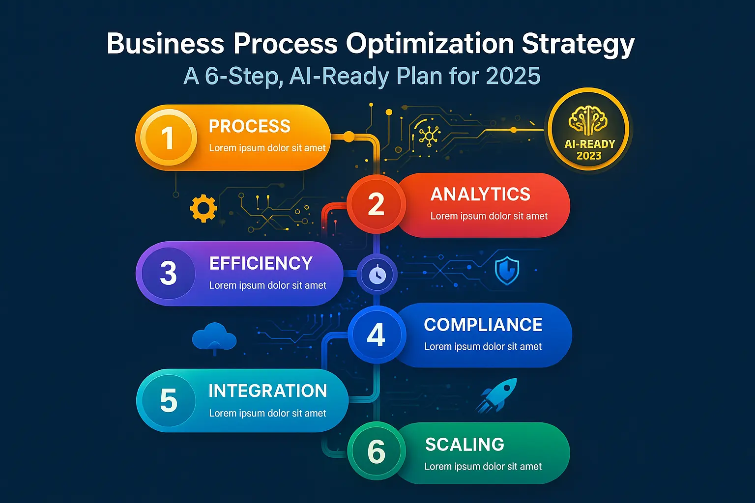
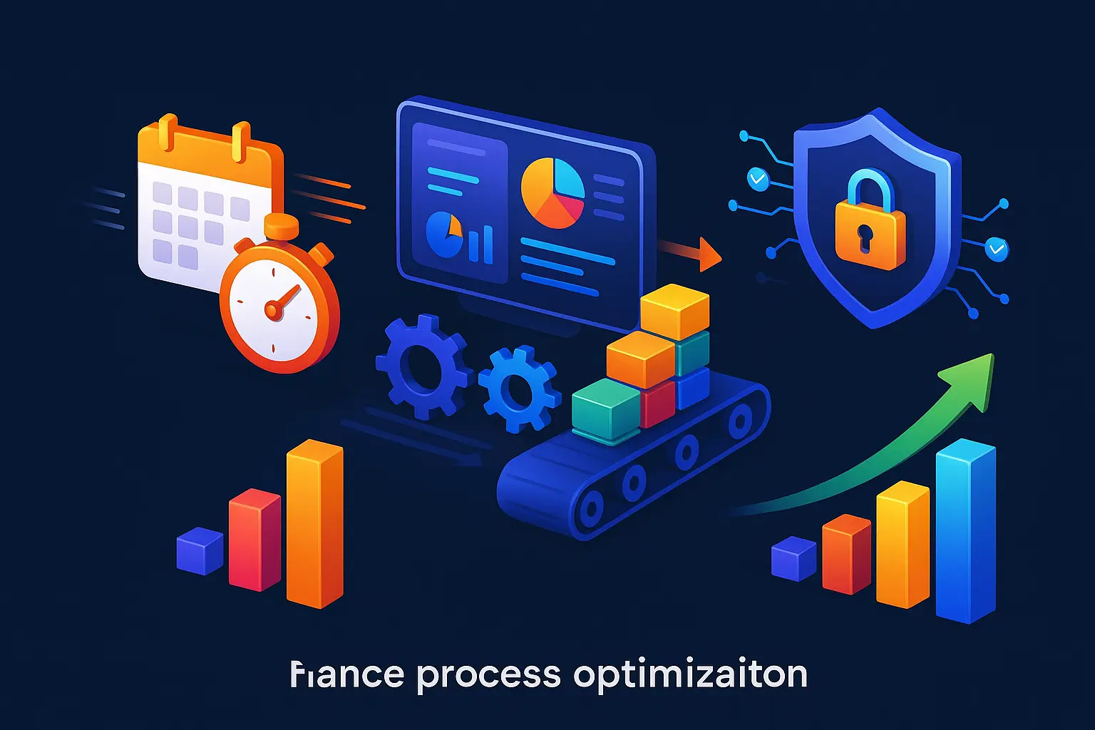
Build your employee performance analytics stack in 30 days
Week 1: Map sources (HRIS, project/issue trackers, CRM/EHR/LMS, ticketing, SSO)
Goal: create a single inventory of every system that contains signals about work, capacity, or outcomes.
Actions: – Run a 90‑minute discovery workshop with leaders from people ops, engineering, product, and operations to list source systems and owners. – For each system capture: owner, data types (events, timestamps, outcomes), retention policies, and access method (API, exports, DB). – Prioritize three sources that unlock the most insight quickly (e.g., ticketing, time off, and a primary workflow system).
Deliverable: a living source map (spreadsheet or lightweight wiki) with owners assigned and the top three extraction tasks scheduled.
Week 2: Clean, join, and baseline; define a shared data dictionary
Goal: make the data reliable and comparable across teams so metrics mean the same thing everywhere.
Actions: – Extract a sample dataset for each prioritized source and run a quick quality check (missing keys, timezone issues, duplicate records). – Build join keys (user ID, team ID, case ID) and document assumptions for each mapping. – Define a short data dictionary with standard metric definitions (e.g., “completed unit”, “FTE denominator”, “after‑hours window”) and agree on calculation rules with stakeholders.
Deliverable: joined baseline tables and a one‑page data dictionary that will be used by dashboards and governance.
Week 3: Dashboards managers actually use (alerts, drilldowns, trendlines)
Goal: deliver a minimal set of actionable dashboards that drive conversations and decisions.
Actions: – Prototype three operational views: a team overview (quality, throughput, capacity), a deep‑dive for managers (drilldowns and root causes), and an alerts page (threshold breaches). – Emphasize clarity: one metric per card, clear timeframes, and a short “so what / next step” note on each dashboard. – Validate prototypes with a small group of managers in a 30‑minute session and iterate based on feedback.
Deliverable: production dashboards with automated refresh, at least two drilldowns per key metric, and one alert rule that triggers a human review.
Week 4: Governance—privacy DPIA, bias checks, sampling, access policies
Goal: put guardrails in place so the stack is ethical, legal, and trusted.
Actions: – Run a privacy/data protection impact assessment (DPIA) for the stack, documenting data minimization and retention choices. – Define access controls: who sees aggregated team scores, who can see member‑level data, and who approves exceptions. – Implement basic bias and validity checks: sample dashboards against manual audits, and require human review before any corrective action is taken based on analytics.
Deliverable: a governance checklist (DPIA sign‑off, access matrix, audit plan) and one policy document managers must follow when using analytics for coaching or performance decisions.
Outputs after 30 days: a funded roadmap, three prioritized dashboards, a shared data dictionary, at least one alerting rule, and governance that keeps analytics ethical and usable. With the stack in place, you’ll be positioned to flip the switch on the six core metrics and tailor them to team workflows so they drive real improvements rather than friction.
Thank you for reading Diligize’s blog!
Are you looking for strategic advise?
Subscribe to our newsletter!
Industry quick‑starts: education, healthcare, insurance
Education: reduce administrative load and measure learning impact
What to prioritize: teacher time reclaimed, administrative task reduction, early indicators of student proficiency, and attendance trends.
Quick pilot ideas: – Deploy a single AI assistant for lesson planning or grading in one grade or department; measure baseline time spent on those tasks for two weeks and repeat after four weeks. – Automate one administrative workflow (attendance reporting, parent communications, or assessment aggregation) and track hours saved and error reduction. – Pair time‑savings data with a short-term student signal (assessment scores, participation rates) to spot early academic impact.
Success criteria: documented hours saved per teacher, examples of reallocated time (coaching, planning, student support), and at least one measurable lift in the selected student signal within one term.
Healthcare: free clinicians for patient care while protecting safety
What to prioritize: reduce time spent on documentation, improve patient throughput and wait times, and lower billing/reconciliation errors while preserving clinical quality and privacy.
Quick pilot ideas: – Run an ambient‑scribe pilot for a small clinic or specialty team and capture clinician after‑hours time, documentation turnaround, and clinician satisfaction pre/post. – Optimize one scheduling or intake bottleneck (triage rules or automated reminders) and measure changes in wait times and no‑show rates. – Target billing or coding for automation-assisted checks and measure reductions in rework or dispute rates.
Success criteria: measurable reduction in non‑patient time for clinicians, improved appointment flow metrics, and documented safeguards (consent, data minimization) for patient data.
Insurance: speed claims, scale underwriting, and reduce compliance lag
What to prioritize: claims cycle time, underwriting throughput, compliance update latency, and early fraud detection signals.
Quick pilot ideas: – Implement AI‑assisted triage for incoming claims in one product line to reduce handoffs and measure end‑to‑end cycle time. – Use summarization tools for underwriters on a subset of cases to measure time per file and decision turnaround. – Automate one compliance monitoring task (regulatory change alerts or filing checks) and measure latency from update to action.
Success criteria: reduced average processing time, higher throughput per underwriter, faster compliance responses, and a clear mapping of saved hours to downstream cost avoidance.
Cross‑industry operating tips: start with a senior sponsor, limit scope to a single team or process, baseline rigorously (time studies + system logs), surface only aggregated/team‑level capacity signals, and require human review for any corrective actions. Use short, measurable pilots to build momentum and trust before scaling.
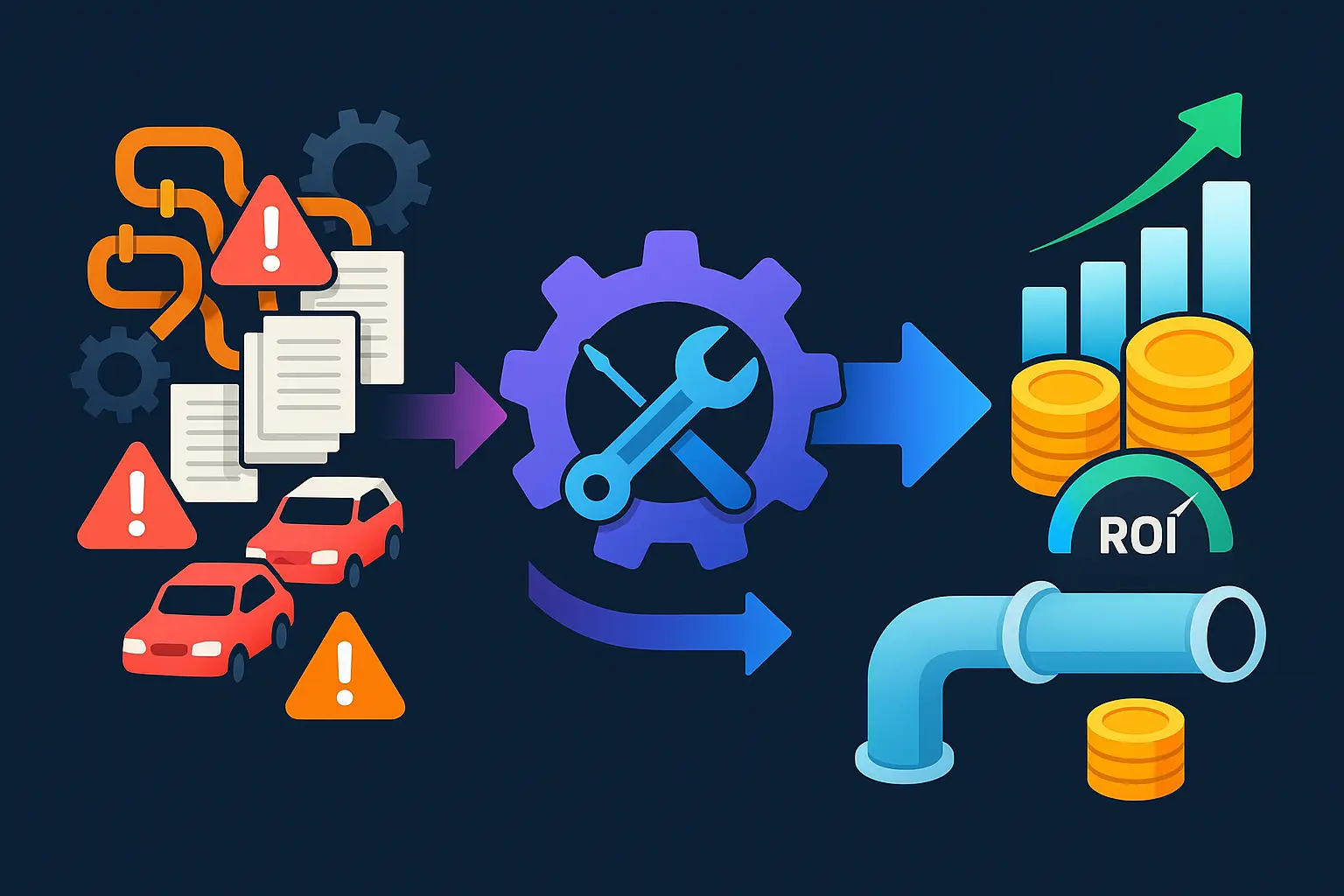
Once pilots produce validated savings and operational improvements, the next step is to convert those results into a financial case—linking hours saved and error reductions to cost and revenue impacts, and tying after‑hours and workload signals to attrition and replacement costs so leadership can prioritize continued investment.
Prove ROI of employee performance analytics with AI assistants
Time‑to‑value model: hours saved x loaded cost + error reduction value
Concept: quantify direct productivity gains from AI by converting time saved into dollar value and adding the avoided cost of errors. Core formula: Value = (Hours saved per period × Loaded hourly cost) + (Estimated error reductions × Cost per error) − Implementation & operating costs.
What you need to measure: baseline task time, time after AI assistance, loaded cost per FTE (salary + benefits + overhead), average frequency and cost of errors or rework. Use short before/after pilots or A/B tests to capture realistic hours saved.
Validation and sensitivity: run a 4–8 week pilot, collect time logs and tool usage metrics, and calculate confidence intervals for hours saved. Present a sensitivity table that shows ROI under conservative, baseline, and optimistic savings assumptions so stakeholders can see downside and upside.
Burnout‑to‑turnover model: link after‑hours work to attrition risk and replacement cost
Concept: translate capacity and wellbeing signals (after‑hours minutes, PTO debt, sick‑leave spikes) into an estimated increase in attrition probability, then multiply by the expected replacement cost to compute risk‑cost avoided.
Model components: baseline attrition rate, marginal increase in attrition per unit of after‑hours (estimated from historical HR correlations or literature), average replacement cost per role (recruiting, ramp, lost productivity). Calculation: Avoided turnover cost = (Reduction in attrition probability × Number of people at risk) × Replacement cost.
How to operationalize: correlate historical after‑hours and workload signals with past departures to estimate the marginal effect. If historical data is thin, use conservative external benchmarks and clearly label assumptions. Use the model to justify investments that reduce sustained after‑hours work, then track whether attrition and voluntary exit intent decline.
Outcome linkage: proficiency/clinical outcomes/NPS to revenue, margin, and retention
Concept: connect operational improvements to business outcomes so leaders can see how employee analytics affects top‑line and margin. The chain is: operational metric → outcome metric (quality, proficiency, patient or customer experience) → financial impact (revenue, avoided churn, reimbursement, premium retention).
Approach: – Select one high‑confidence linkage (for example, quality rate → fewer defects → lower warranty or remediation cost, or clinician time freed → more billable patient encounters). – Use an attribution window and control groups where possible (pilot vs. matched control teams) to isolate the effect of AI assistance. – Convert outcome changes to dollars using agreed unit economics (e.g., revenue per encounter, cost per defect, churn value).
Statistical rigor: apply simple causal methods — difference‑in‑differences, interrupted time series, or regression with controls — and report effect sizes with p‑values or confidence intervals. Present both gross and net financial impact after subtracting implementation, licensing, and change‑management costs.
Practical tips for executive buy‑in: present three scenarios (conservative, expected, optimistic) and a clear payback timeline; include non‑financial benefits (reduced burnout risk, improved satisfaction) as qualitative but tracked KPIs; and require a baseline measurement plan before any rollout. With a defensible time‑to‑value estimate, a turnover risk model, and a clear outcome linkage, you can convert pilot wins into a scalable business case that makes continued investment a no‑regret decision.